DESIGN RULES
Principles and practices for useful, usable, impactful UI design.
Great UI design isn't an accident.
When it comes to User Interface (UI) design, your job — whether you're a designer, developer, UXer or a mix of all those things — is to make sure that no aspect of someone’s onscreen interaction happens without explicit intent. The UI design choices we make have to reflect the user’s motivations, expectations, environment and possible actions.
All of those things manifest themselves in the User Interface — so what people see on the screen is usually the sum of their understanding about what this is and how it works.
So what we show them has to do a hell of a job communicating what’s there for them, how it’s organized, how they get to it and what they can do with it once they do.
Technology changes — the rules don't.
The principles, practices and real-world techniques I'm going to show you here are the same ones that have informed graphic design for hundreds of years. And while that may sound like blasphemy to some of you, I guarantee you'll see why and how they apply equally to the world of digital design — especially for mobile devices and their small screens.
I'm going to give you 50 lessons packed with timeless, ironclad, unchanging rules for good UI design that you can apply to anything and everything you ever work on. Trends will come and go, and it won't matter: your UI will still be useful, usable, appropriate and relevant for its users.
You'll learn how to make it easier for people to interact with what they see on the screen – whether they know what to tap, swipe or click, and whether what happens meets their expectations and moves them closer to their goals. You'll learn how to create and apply hierarchy, color, contrast, typography and gestalt principles to design appropriate visual cues so people know where and how to take action.
I'll show you how to make good visual decisions for even the most challenging applications, from simplifying complex visual information to designing with data. My goal with this course is to give you everything you need to know to make great UI design decisions, no matter what the content, context or product may be.
From this point forward, you'll be equipped to make strategic, impactful User Interface designs that communicate, guide, encourage, motivate and educate. Anything else is decoration, and decoration has a very short shelf life.
By the time you finish Design Rules, you'll be able to do much more than create a more beautiful User Interface. Instead, you'll be able to design a UI that truly works for the people who use it. One that it allows them to easily figure out where to start and how to get what they need — quickly, efficiently and intuitively.
Of course, it'll also just happen to be beautiful ;-)
WHAT YOU'LL LEARN
- Be able to create useful, usable and visually compelling UI design for any kind of app, site or system.
- Understand how to properly balance form and function.
- Understand the critical rules for designing on small screens and mobile devices.
- Know how to effectively organize and economize visual information.
- Understand + apply the principle of Balance to create visual order.
- Understand + apply the principle of Rhythm to establish and reinforce comprehension.
- Understand + apply the principle of Harmony to shape disparate UI elements into a unified, consistent experience.
- Understand + apply the principle of Dominance to direct user focus and enhance UX.
- Understand + apply the principle of Alignment to lead the user's eye and speed task completion.
- Understand + apply the principle of Proximity to signal relationships between screen elements and decrease users' cognitive effort.
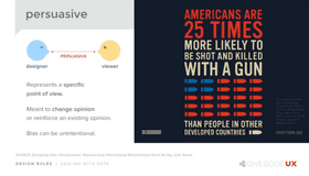
- Communicate with color, typography and imagery in the UI.
- Understand how color communicates and influences interaction.
- Know how to choose the right colors for any UI design.
- Know how to apply contrast properly to guide users and call attention to critical UI elements and interactions.
- Know how to determine whether or not color and contrast are appropriate.
- Understand the fundamentals of typography as a design element.
- Know how to choose the right fonts and design appropriately with them.
- Understand + apply a core set of DOs and DON'Ts when designing with images.
- Know how to create and simplify visual cues that direct user focus and interaction.
- Understand how the context of the data presented determines its visual form.
- Know how to simplify visual information to clarify meaning and improve UX.
- Know how to visually separate content from controls to make interactions easier for users to understand and act on.
- Walk away with a set of "18 UI Design Mantras" that you can apply to anything and everything you ever design!
50 Lessons
Already Joined? Login
Ground Rules: What You Need to Know Upfront

Design is Design is Design.
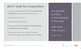
Stop Solving Other People's Problems
Form Doesn't (and Shouldn't) Follow Function
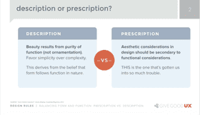
Balancing Form and Function: Prescription vs. Description

Why Form Follows Function is NOT a UI Design Prescription!
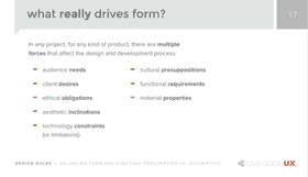
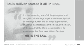
Every Force Evolves Form (So Don't Follow the Prescription)

Less is More: Small Screens, Big Challenges
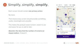
Five Rules for Effective UI Design on Small Screens
Organizing Visual Information

Balance: Creating Visual Order
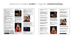
Case Studies: Improving Balance in the User Interface

Rhythm: Establishing and Reinforcing Comprehension

Harmony: Shaping the Parts Into a Whole
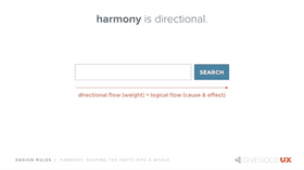
Using Harmony to Create Directional Flow

Case Study: Using Harmony for Better Form Design

Dominance: Directing (and Maintaining) User Focus

Using Dominance to Increase Focus — and Decrease Cognitive Effort

Creating Dominance with Size, Negative Space and Contrast
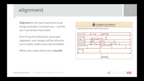
Alignment: Leading the Eye Across the Screen

Case Studies: The Power of Alignment

Proximity: Showing and Communicating Visual Relationships
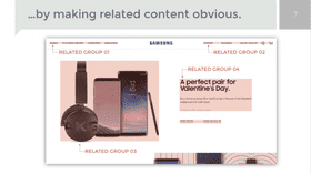
Using Proximity to Make Cognition Faster

Case studies: Using Proximity to Make Browsing Easier
Using Color and Contrast Appropriately
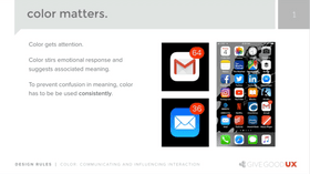
Color: Getting Attention and Communicating Emotion

How Color Influences Interaction
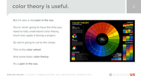
A Word on Color Theory — and Using Color Correctly
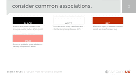
How to Choose the Right Colors for your UI: Common Associations

How to Choose the Right Colors for your UI: Emotional Impact

How to Choose the Right Colors for your UI: From the World Around You
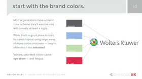
How to Choose the Right Colors for your UI: From Brand Colors

The Power of Contrast
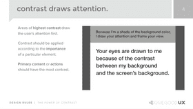
Using Contrast to Improve Readability, Attention and Focus

Three Essential Functions of Contrast in UI Design

How to Determine Appropriate Color and Contrast
Designing with Typography and Imagery
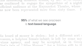
Typography 101: It's About Much More Than Choosing a Font!

Creating Emotional Impact with Typography
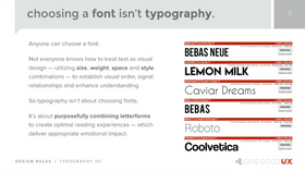
Choosing a Font Isn't Typography: The Importance of Pattern Recognition
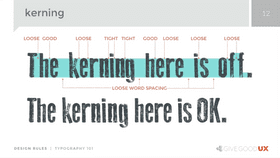
The Importance of Proper Alignment, Leading and Kerning

Seven Rules for Great Typography

Five Rules for Choosing Imagery
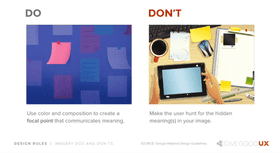
Imagery DOs and DON'Ts
Creating and Simplifying Visual Cues

Working with Icons

Four Core Types of Icons (and How to Choose the Right Type)

Five Rules for Effective Icon Design
Dealing with Data

Five Rules for Great Data Design
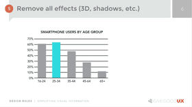
Simplifying Visual Information Part 01

Simplifying Visual Information Part 02

Separating Content from Controls Part 01
Separating Content from Controls Part 02
Things to Remember